
The context
C’Choux is a sustainable fresh produce app designed to connect local producers and urban gardeners with conscious consumers who value high-quality, responsibly sourced products. The platform promotes transparency, traceability, and a collaborative, bartering-based economy.
I developed the artistic direction and interface design, establishing the brand identity and developing a landing page as initial deliverables, with plans to integrate a mobile application later.
The challenge
In developing C’Choux, we needed to create a strong, memorable brand identity that would effectively communicate the values of sustainability, collaboration, and transparency. We also aimed to design an attractive yet highly functional user interface that would simplify the listing, discovery, and bartering of products, reflecting the project’s emphasis on clarity and ease of use.
We had to integrate C’Choux’s value proposition into a competitive market, differentiating it from other food marketplaces by highlighting traceability and community-driven collaboration as central selling points.

The Solution
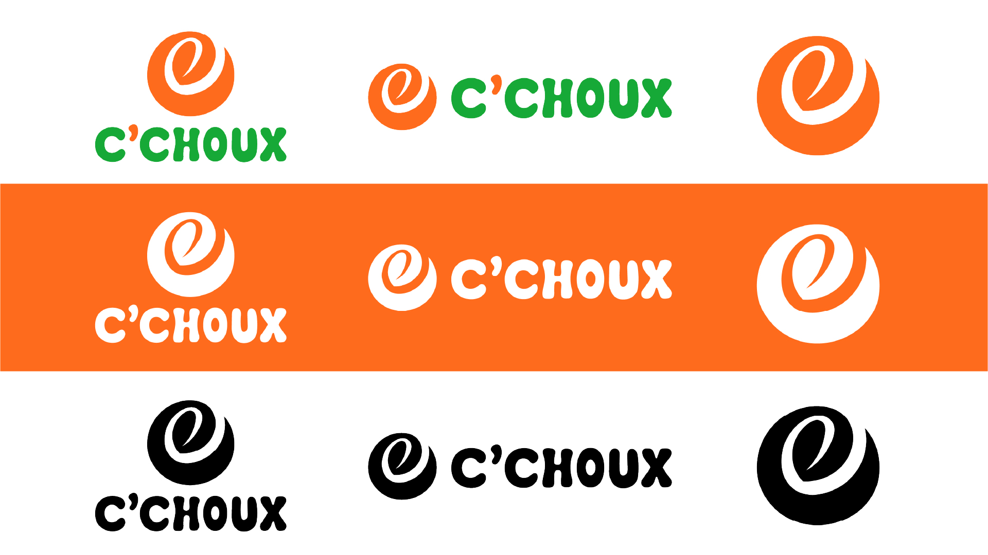
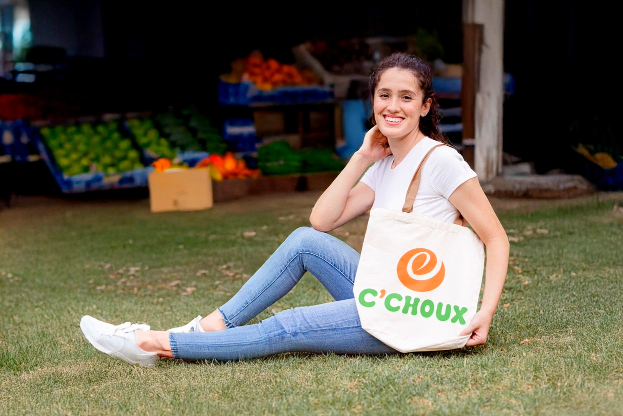
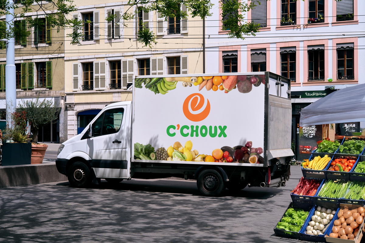
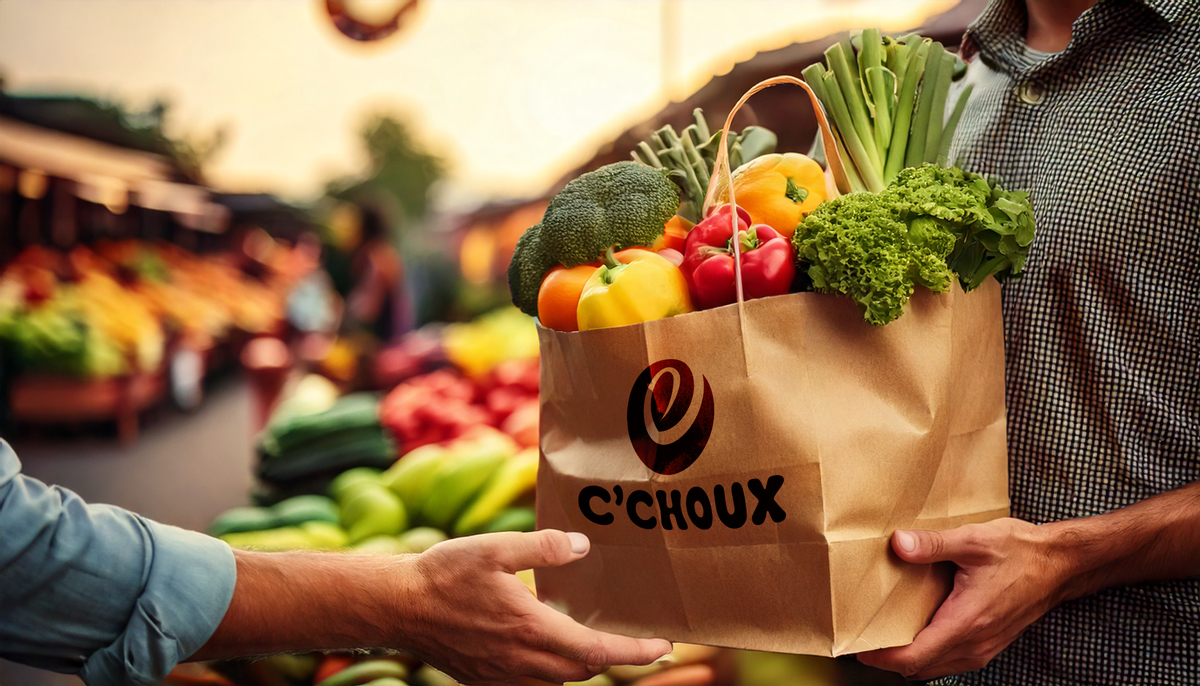
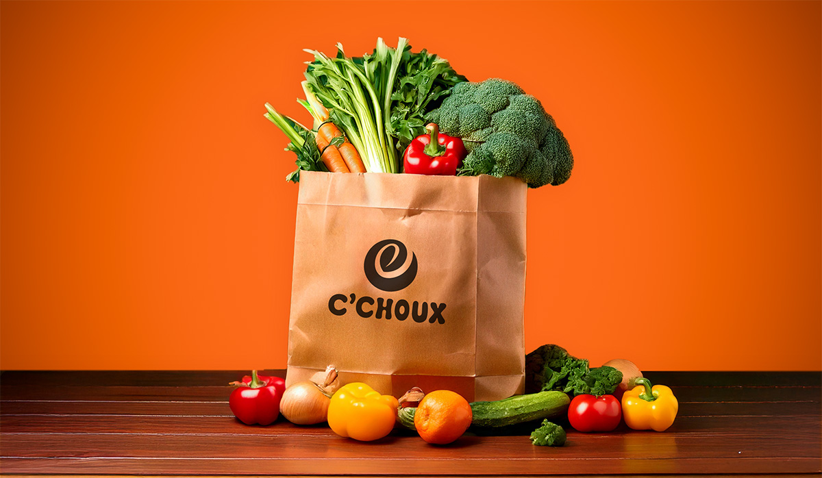
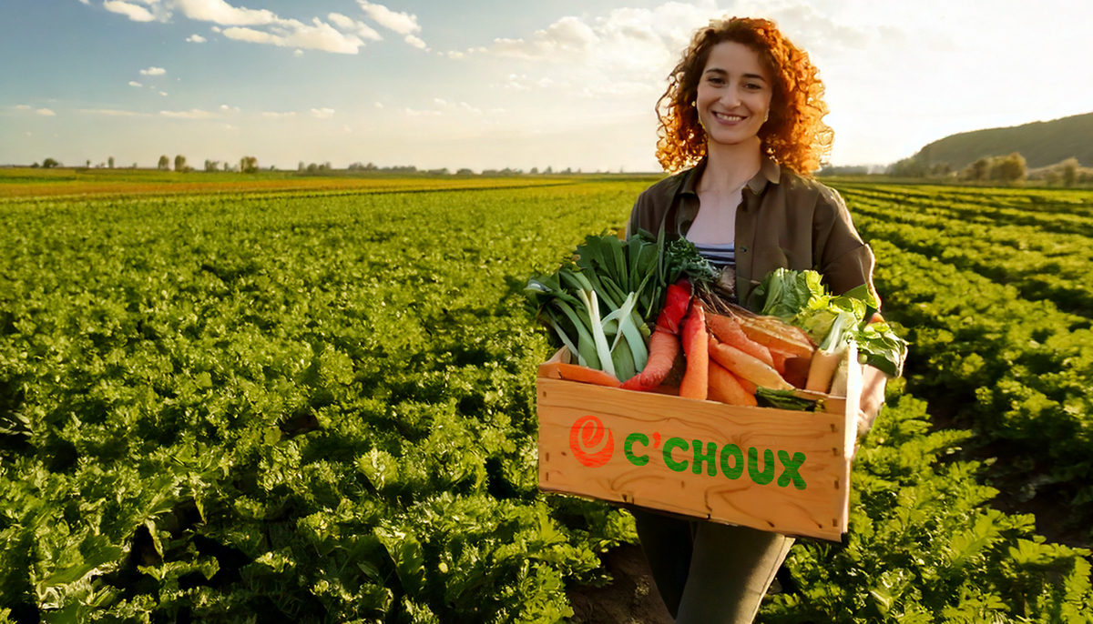
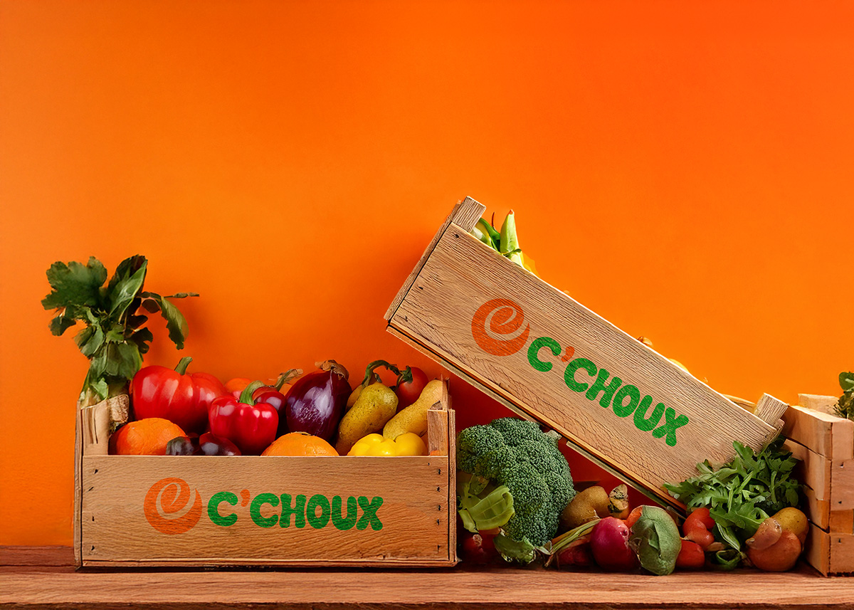
To address these challenges, we pursued a strategic art direction that incorporated a vibrant color palette (featuring orange, green, and yellow) alongside friendly typography, conveying both freshness and a sense of communal warmth. We developed the name C’Choux and its logo to evoke a playful, welcoming tone, emphasizing local and eco-friendly values.
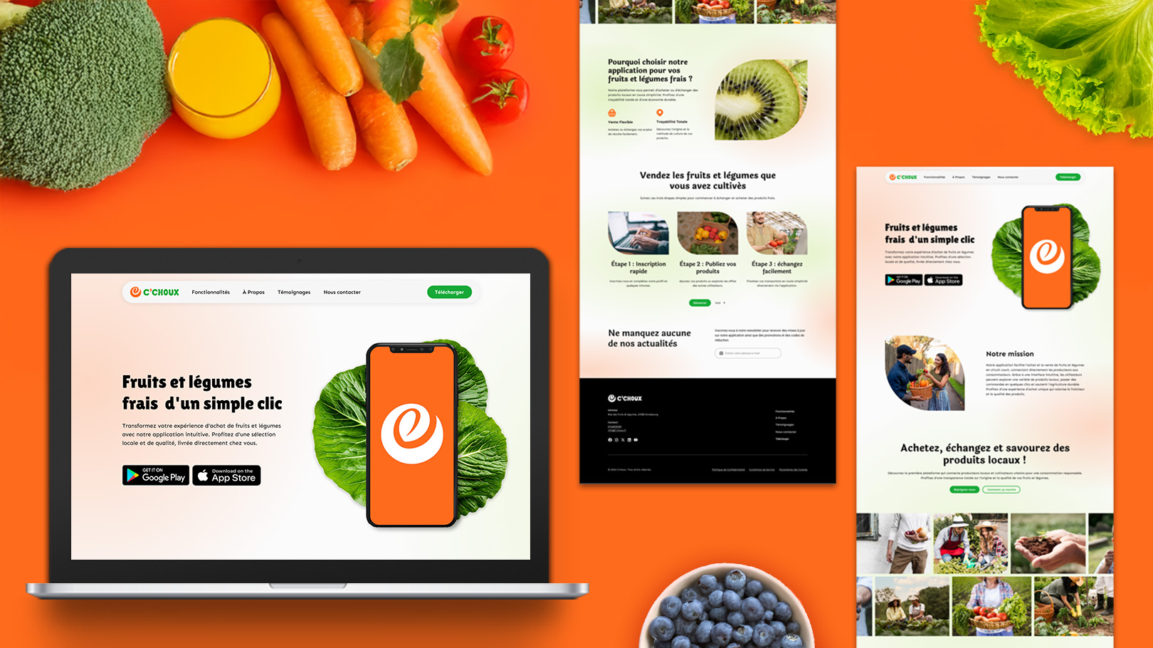
This approach was then translated into a UI/UX design for the landing page, which adopts a clear, conversion-focused layout to showcase the platform’s key benefits. The navigation is intuitive, and the content is structured to highlight C’Choux’s mission, vision, and core functionalities, with prominent calls to action that invite users to join and learn more about the upcoming mobile application.



The results
The resulting brand identity is cohesive and sets C’Choux apart from other fresh-produce platforms, clearly conveying warmth, trust, and environmental responsibility.
The functional landing page effectively communicates the platform’s value proposition and operating model, generating interest and paving the way for the mobile application.
Because the design and architecture are primed for growth, the platform can seamlessly scale, incorporating new features and integrating with the upcoming mobile app.
By combining art direction and interface design, C’Choux now has a clear identity and a scalable system that will ultimately evolve into a robust mobile application aligned with its mission.
Interested in creating a sustainable and user-friendly app for your brand?
Take a look at my other projects
Explore my portfolio to see how I’ve helped brands create meaningful connections through design.

Café Cowboy
Premium coffee brand
Art direction
Brand image
Logo animation

FamiYoga
Yoga and therapeutic services
Art direction
Brand image
Social media
Content
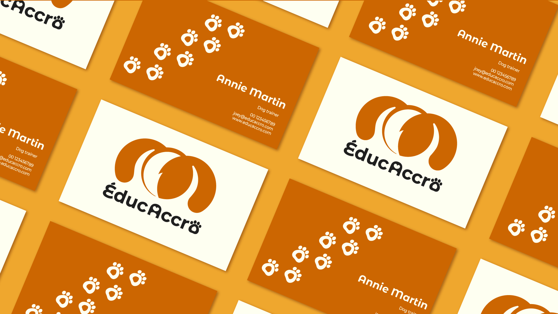
Éduc-Accro
Joyful dog training brand
