
Wellness Retreat Landing Page Design & Brand Image
Concept project · Landing Page · Web Design · Brand Identity · Multilingual Copywriting

Case of study
Conversion-focused wellness retreat web design: A look inside the project
Context & Challenge: Designing for a Wellness Retreat Beyond Greenwashing
Nido began as a self-initiated concept project: an opportunity to develop a wellness retreat landing page design from the ground up using the same strategic process I would apply to a real client, without the limitations of external deadlines or stakeholder approvals.
The concept was built around a five-day wellness retreat in Canaima, Venezuela, where rest and sustainability are inseparable from reciprocity. Every part of the experience involves collaboration with the local Pemón community.
Today’s conscious travelers have learned to question vague claims, polished imagery, and generic messages about “eco-friendly” experiences, they want evidence before they commit.
The challenge was to create beautiful wellness retreat website design that stands out from generic retreat brands. The landing page needed to build enough trust for a high-consideration purchase in a market where sustainability has become an overused marketing promise, and communicate a more credible vision of sustainable tourism brand design.
My Strategic Approach: From Brand Research to Landing Page Design
My strategic web design process begins with a research and analysis phase, which is essential for understanding what the site needs to offer its target customers and how to guide them toward making a reservation. It was this research that shaped everything that followed.
For Nido, I explored both the cultural context of Canaima and the mindset of its ideal guest: someone seeking genuine rest, meaningful experiences, and clear proof that the retreat’s values extend beyond marketing. These insights shaped the brand strategy for this wellness brand before a single wireframe was created.
From there, I structured the page around the visitor’s decision-making journey. Instead of leading with logistics or pricing, the content first creates an emotional connection, then builds trust, answers practical questions, and only afterwards introduces the investment. Each section exists to reduce friction and move the visitor naturally toward a reservation.
With the content strategy in place, I wrote the copy before designing the layout. This approach ensured every visual decision supported the message, resulting in a conversion-focused landing page design where strategy drives every interaction.
Brand Identity: Turning Research Into a Visual System
I developed Nido’s visual identity as a foundation for the brand’s entire digital experience. A strong retreat brand identity design that can be translated into a visual language to help the right audience recognize, trust, and connect with the brand.
The identity was built around the relationship between the retreat and the Canaima territory. The logo combines references to Pemón basket weaving techniques and spiral-shaped petroglyphs found in the region, creating a symbol that can also be interpreted as a nest viewed from above. A representation of origin, connection, and belonging.
The visual system also extends beyond the logo through a nature-inspired color palette, organic typography, hand-drawn illustrations, and custom icons. These elements were designed to communicate the same values as the retreat itself: authenticity, craftsmanship, and a meaningful connection with the environment.
Once the identity system was established, it became the visual foundation for the landing page, ensuring that every interaction felt consistent, intentional, and aligned with the brand’s positioning.
A Conversion-Focused Wellness Retreat Landing Page
Conversion Strategy, From the Hero Down
Nido’s conversion-focused landing page design guides visitors through a decision process. Every section was intentionally structured to build desire, establish trust, and reduce hesitation before asking for a reservation.
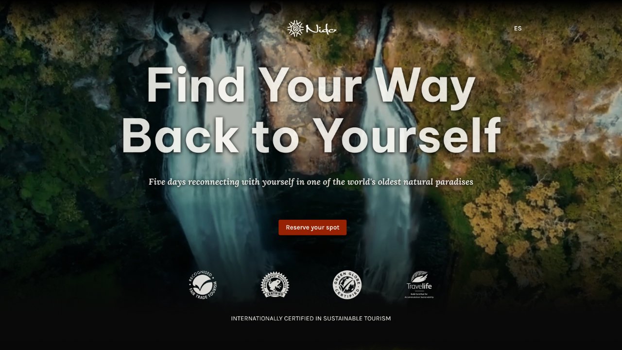
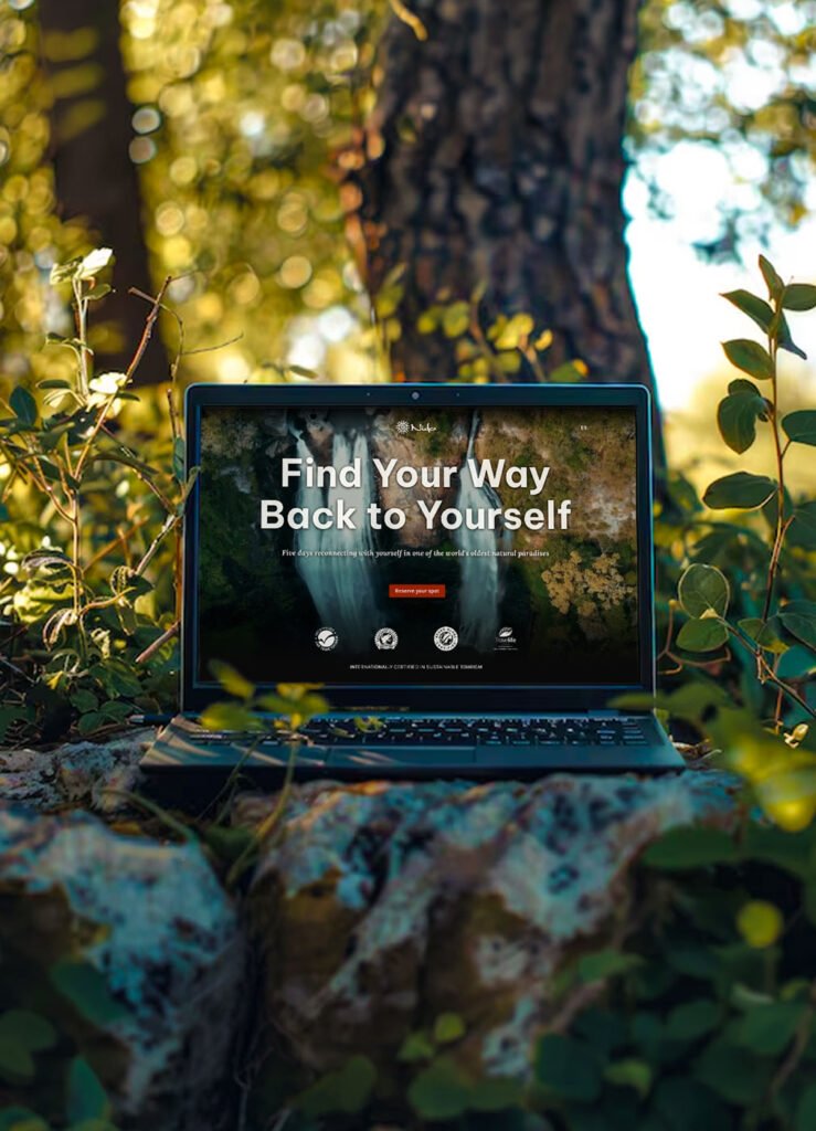
In a wellness retreat landing page design the first impression is critical. The hero section is the only part of a page that 100% of visitors see, and its immediate impact is crucial in determining whether a visitor decides to keep scrolling to view the rest of the page. To maximize the impact of that first impression I made the following strategic decisions:
• A full-screen background video showcases the real retreat experience, along with an entertaining, clear, and empathetic headline, to catch the eye and immediately connect on an emotional level.
• A single, focused CTA to reduce decision fatigue and guides users toward the next step.
• Showing sustainability certifications to provide an immediate trust and build credibility from the very beginning.
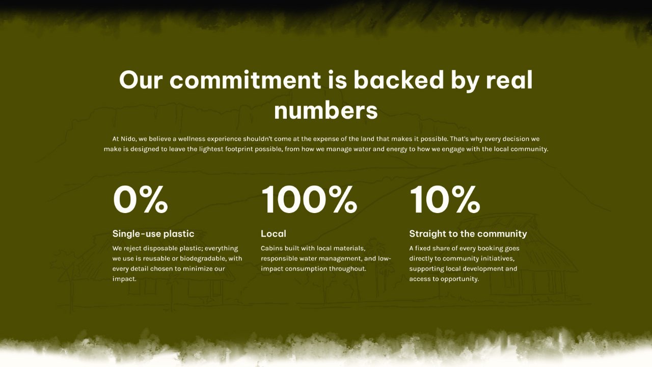
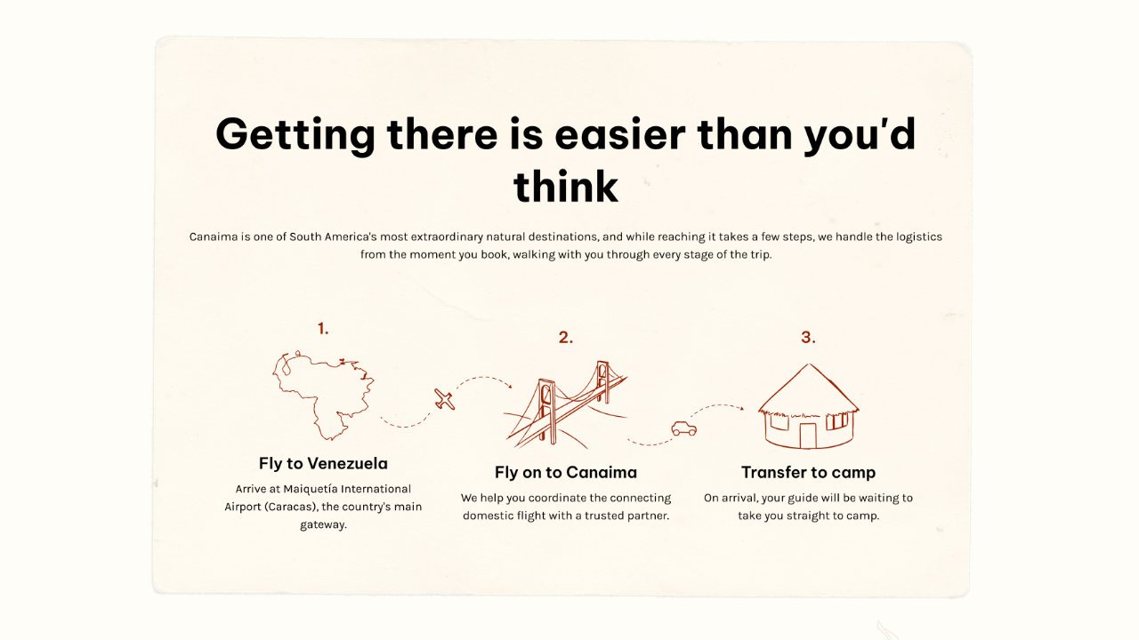
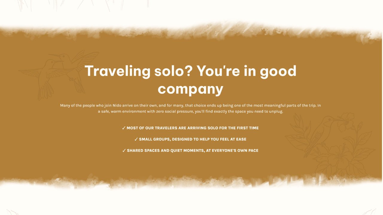
The rest of the conversion-focused landing page design is dedicated to building trust and removing friction before asking visitors to book. Specific, verifiable impact metrics replace generic sustainability claims, while a dedicated section for solo travelers and a clear travel logistics infographic proactively address common concerns and reinforce confidence throughout the user journey.
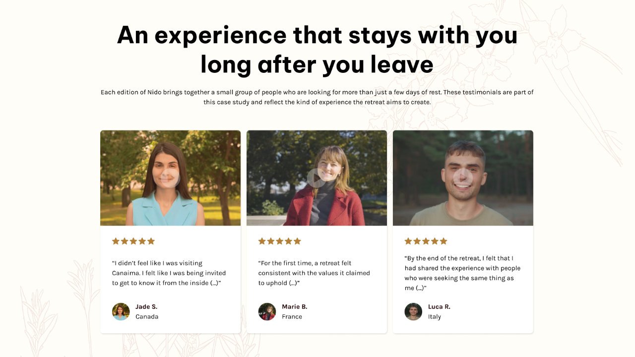
This same principle led to the use of video testimonials strategically placed before the booking call-to-action (CTA), as evidence shows that this format can improve conversion rates by more than 40%, making them one of the most effective ways to reinforce credibility at a key moment in the decision-making process.
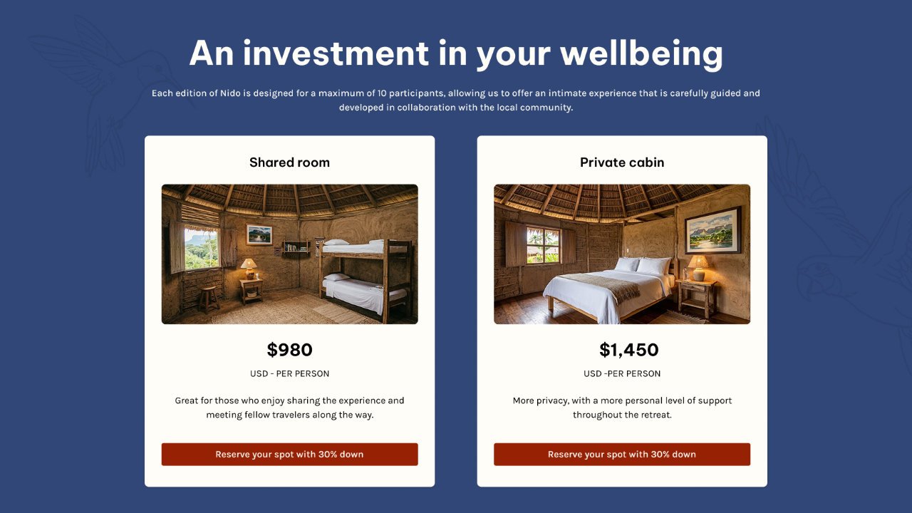
Finally, the investment is only addressed once enough trust has been established, which leads to a more natural and convincing booking process.
A Mobile-First, Device-Aware Experience
In the travel industry, mobile devices generate around 70% of website traffic, yet desktop users still convert at nearly three times the rate. This makes mobile-first landing page design more about understanding the role each device plays within the booking journey insted of just shrinking a screen.
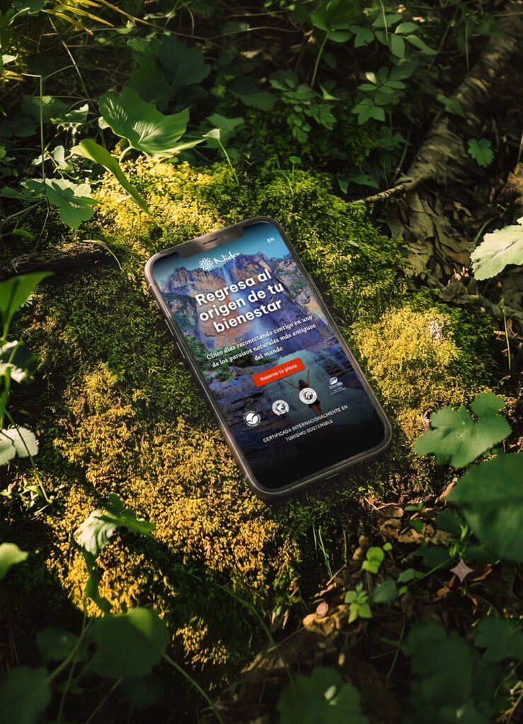
On mobile, the priority is speed and clarity. The desktop background video is replaced with a high-impact, full-screen static image, preserving the same emotional immersion while solving one of the biggest UX challenges on mobile: loading performance is a critical factor in reducing abandonment.
A persistent booking bar keeps the primary CTA within natural thumb reach, in the lower-right corner where it’s easiest to tap during one-handed browsing, making it effortless to act the moment a visitor is ready.
Content hierarchy was adapted the same way. The day-by-day itinerary keeps its narrative flow in a clean vertical format, and video testimonials load on demand, protecting speed while keeping one of the page’s strongest trust-building elements fully intact.
The mobile version delivers the same message and the same conversion-focused path, but with strategic changes considering its role in how and where visitors are most likely to discover, evaluate, and ultimately book the retreat.
A Multilingual Retreat Website
Around 60% of global consumers prefer browsing websites in their native language. Companies that move from a single-language site to a multilingual website report sales increases of at least 25%, with some seeing gains as high as 70%, showing that, for many users, the decision to buy or reserve depends strongly on the ability to understand the information easily and without additional barriers.
This multilingual retreat website was designed in English and Spanish, with each version adapted to preserve the brand’s tone, emotional impact, and conversion flow.
This is where my own multilingual, multicultural background shapes my work directly. Content was never delegated to automated translation tools, insted, each version followed the same strategic process as the original copy, shaped by an understanding of how different audiences build trust.
For an international wellness retreat like Nido, multilingual content is an essential part of the conversion strategy.
Accessible by Design
The same principles that support users with disabilities also support anyone browsing in bright sunlight, distracted while planning a trip, or simply looking for a clearer, faster way to find information. When you factor in these everyday, situational moments, accessible design ends up benefiting the majority of visitors, not a minority.
That’s why during the conseption of this wellness retreat landing page, accessible web design principles were integrated from the beginning: clear contrast, logical heading structure, predictable navigation, and consistent CTAs were decisions that make the page easier to use for every visitor, not just a specific group.
Users tend to abandon websites that are hard to use or navigate. For Nido, that meant keeping text legible across every background, following a clear heading order, and structuring content to reduce cognitive load. These details make the experience smoother whether someone’s quickly scanning on their phone or relying on assistive technology.
For a wellness retreat centered on reciprocity, an inclusive web design that works better for everyone is a reflection of the brand itself.
The Results: What Strategic Design Achieves for a Wellness Retreat
This project for a wellness retreat web design resulted in a web design that successfully conveys the values and essence of the experience, transforms skepticism into trust, and communicates clearly with anyone who comes across it, no matter what device they’re using.
Nido’s conversion-focused landing page design is built to outperform the category it competes in. While most retreat sites lean on the same vague sustainability language and generic wellness imagery, Nido focuses on understanding the traveler’s real needs, giving a skeptical visitor genuine reasons to believe, while minimizing every point of friction along the way.
That’s what turns a beautifully designed page into one that actually converts.
Context & Challenge: Designing for a Wellness Retreat Beyond Greenwashing
Nido began as a self-initiated concept project: an opportunity to develop a wellness retreat landing page design from the ground up using the same strategic process I would apply to a real client, without the limitations of external deadlines or stakeholder approvals.
The concept was built around a five-day wellness retreat in Canaima, Venezuela, where rest and sustainability are inseparable from reciprocity. Every part of the experience involves collaboration with the local Pemón community.
Today’s conscious travelers have learned to question vague claims, polished imagery, and generic messages about “eco-friendly” experiences, they want evidence before they commit.
The challenge was to create beautiful wellness retreat website design that stands out from generic retreat brands. The landing page needed to build enough trust for a high-consideration purchase in a market where sustainability has become an overused marketing promise, and communicate a more credible vision of sustainable tourism brand design.
My Strategic Approach: From Brand Research to Landing Page Design
My strategic web design process begins with a research and analysis phase, which is essential for understanding what the site needs to offer its target customers and how to guide them toward making a reservation. It was this research that shaped everything that followed.
For Nido, I explored both the cultural context of Canaima and the mindset of its ideal guest: someone seeking genuine rest, meaningful experiences, and clear proof that the retreat’s values extend beyond marketing. These insights shaped the brand strategy for this wellness brand before a single wireframe was created.
From there, I structured the page around the visitor’s decision-making journey. Instead of leading with logistics or pricing, the content first creates an emotional connection, then builds trust, answers practical questions, and only afterwards introduces the investment. Each section exists to reduce friction and move the visitor naturally toward a reservation.
With the content strategy in place, I wrote the copy before designing the layout. This approach ensured every visual decision supported the message, resulting in a conversion-focused landing page design where strategy drives every interaction.
Brand Identity: Turning Research Into a Visual System
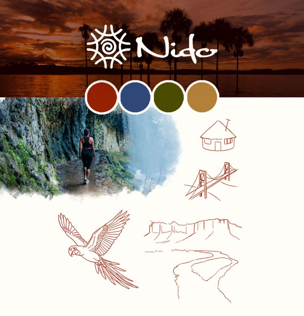
I developed Nido’s visual identity as a foundation for the brand’s entire digital experience. A strong retreat brand identity design that can be translated into a visual language to help the right audience recognize, trust, and connect with the brand.
The identity was built around the relationship between the retreat and the Canaima territory. The logo combines references to Pemón basket weaving techniques and spiral-shaped petroglyphs found in the region, creating a symbol that can also be interpreted as a nest viewed from above. A representation of origin, connection, and belonging.
The visual system also extends beyond the logo through a nature-inspired color palette, organic typography, hand-drawn illustrations, and custom icons. These elements were designed to communicate the same values as the retreat itself: authenticity, craftsmanship, and a meaningful connection with the environment.
Once the identity system was established, it became the visual foundation for the landing page, ensuring that every interaction felt consistent, intentional, and aligned with the brand’s positioning.
A Conversion-Focused Wellness Retreat Landing Page
Conversion Strategy, From the Hero Down
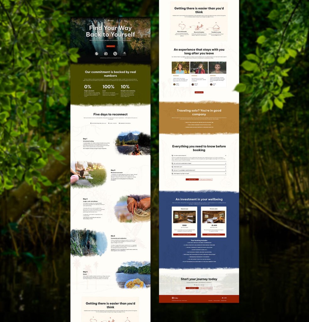
Nido’s conversion-focused landing page design guides visitors through a decision process. Every section was intentionally structured to build desire, establish trust, and reduce hesitation before asking for a reservation.
In a wellness retreat landing page design the first impression is critical. The hero section is the only part of a page that 100% of visitors see, and its immediate impact is crucial in determining whether a visitor decides to keep scrolling to view the rest of the page. To maximize the impact of that first impression I made the following strategic decisions:
• A full-screen background video showcases the real retreat experience, along with an entertaining, clear, and empathetic headline, to catch the eye and immediately connect on an emotional level.
• A single, focused CTA to reduce decision fatigue and guides users toward the next step.
• Showing sustainability certifications to provide an immediate trust and build credibility from the very beginning.
The rest of the conversion-focused landing page design is dedicated to building trust and removing friction before asking visitors to book. Specific, verifiable impact metrics replace generic sustainability claims, while a dedicated section for solo travelers and a clear travel logistics infographic proactively address common concerns and reinforce confidence throughout the user journey.
This same principle led to the use of video testimonials strategically placed before the booking call-to-action (CTA), as evidence shows that this format can improve conversion rates by more than 40%, making them one of the most effective ways to reinforce credibility at a key moment in the decision-making process.
Finally, the investment is only addressed once enough trust has been established, which leads to a more natural and convincing booking process.
A Mobile-First, Device-Aware Experience
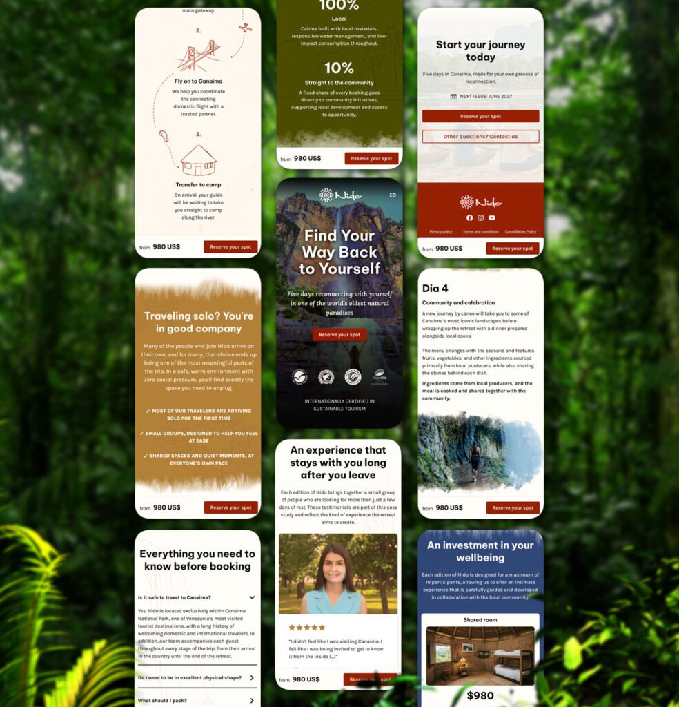
In the travel industry, mobile devices generate around 70% of website traffic, yet desktop users still convert at nearly three times the rate. This makes mobile-first landing page design more about understanding the role each device plays within the booking journey insted of just shrinking a screen.
On mobile, the priority is speed and clarity. The desktop background video is replaced with a high-impact, full-screen static image, preserving the same emotional immersion while solving one of the biggest UX challenges on mobile: loading performance is a critical factor in reducing abandonment.
A persistent booking bar keeps the primary CTA within natural thumb reach, in the lower-right corner where it’s easiest to tap during one-handed browsing, making it effortless to act the moment a visitor is ready.
Content hierarchy was adapted the same way. The day-by-day itinerary keeps its narrative flow in a clean vertical format, and video testimonials load on demand, protecting speed while keeping one of the page’s strongest trust-building elements fully intact.
The mobile version delivers the same message and the same conversion-focused path, but with strategic changes considering its role in how and where visitors are most likely to discover, evaluate, and ultimately book the retreat.
A Multilingual Retreat Website
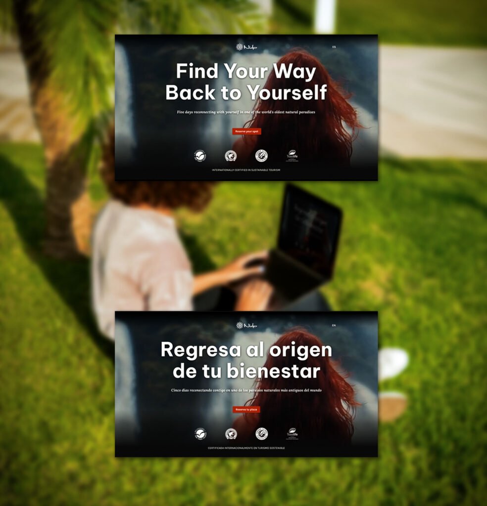
Around 60% of global consumers prefer browsing websites in their native language. Companies that move from a single-language site to a multilingual website report sales increases of at least 25%, with some seeing gains as high as 70%, showing that, for many users, the decision to buy or reserve depends strongly on the ability to understand the information easily and without additional barriers.
This multilingual retreat website was designed in English and Spanish, with each version adapted to preserve the brand’s tone, emotional impact, and conversion flow.
This is where my own multilingual, multicultural background shapes my work directly. Content was never delegated to automated translation tools, insted, each version followed the same strategic process as the original copy, shaped by an understanding of how different audiences build trust.
For an international wellness retreat like Nido, multilingual content is an essential part of the conversion strategy.
Accessible by Design
The same principles that support users with disabilities also support anyone browsing in bright sunlight, distracted while planning a trip, or simply looking for a clearer, faster way to find information. When you factor in these everyday, situational moments, accessible design ends up benefiting the majority of visitors, not a minority.
That’s why during the conseption of this wellness retreat landing page, accessible web design principles were integrated from the beginning: clear contrast, logical heading structure, predictable navigation, and consistent CTAs were decisions that make the page easier to use for every visitor, not just a specific group.
Users tend to abandon websites that are hard to use or navigate. For Nido, that meant keeping text legible across every background, following a clear heading order, and structuring content to reduce cognitive load. These details make the experience smoother whether someone’s quickly scanning on their phone or relying on assistive technology.
For a wellness retreat centered on reciprocity, an inclusive web design that works better for everyone is a reflection of the brand itself.
The Results: What Strategic Design Achieves for a Wellness Retreat
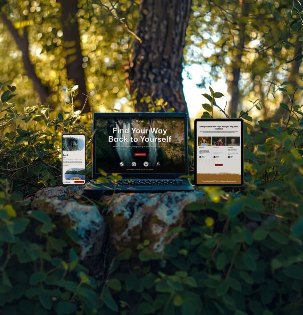
This project for a wellness retreat web design resulted in a web design that successfully conveys the values and essence of the experience, transforms skepticism into trust, and communicates clearly with anyone who comes across it, no matter what device they’re using.
Nido’s conversion-focused landing page design is built to outperform the category it competes in. While most retreat sites lean on the same vague sustainability language and generic wellness imagery, Nido focuses on understanding the traveler’s real needs, giving a skeptical visitor genuine reasons to believe, while minimizing every point of friction along the way.
That’s what turns a beautifully designed page into one that actually converts.
Take a look at the prototype
See the wellness retreat landing page design built to turn visitors into bookings
Explore the interactive prototype and picture what this level of strategy could look like for your own brand.
Your business’s next chapter
Let's build something great together
Ready to turn your wellness or retreat website into your most powerful business tool? Let’s have a free discovery call to talk about your project and how a strategic wellness retreat landing page design can help you achieve your goals.