
The context
FamiYoga is a wellness-focused brand dedicated to creating moments of tranquility and promoting a mindful lifestyle. Through yoga and therapeutic services, FamiYoga helps individuals connect with their body and mind, fostering balance, healing, and meditation. The brand’s mission is to encourage self-awareness and inner peace, making well-being an integral part of daily life.
The project involved designing a logo that represents FamiYoga’s core values while highlighting its personalized and compassionate approach to teaching yoga.
The logo needed to resonate with a diverse audience, including older adults, spiritual individuals, stressed professionals, and homemakers, while reflecting the brand’s commitment to inclusivity and harmony.
The chalenge
In a competitive urban market where numerous established concurrents, FamiYoga faced the challenge of carving out a distinct identity. The brand needed to communicate its unique empathetic methodology and personalized approach to yoga instruction, which caters to the specific needs and rhythms of its diverse clientele.
From a branding perspective, the challenge was to design a logo that not only captured FamiYoga’s mission, values, and services but also stood out in a crowded field.
The design needed to convey trust, professionalism, and harmony while resonating emotionally with potential clients, all within a cohesive and adaptable visual identity that could compete with more established names.

The Solution
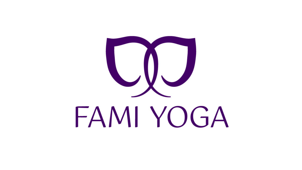
The logo design draws inspiration from the symbolic and cultural significance of the elephant in yoga and wellness. The final symbol features two elephants facing each other with intertwined trunks, a representation of love, connection, and harmony. Alternatively, the design can also be interpreted as a single elephant viewed from the front, adding depth to its meaning. This choice reflects the values of empathy, balance, and self-acceptance.
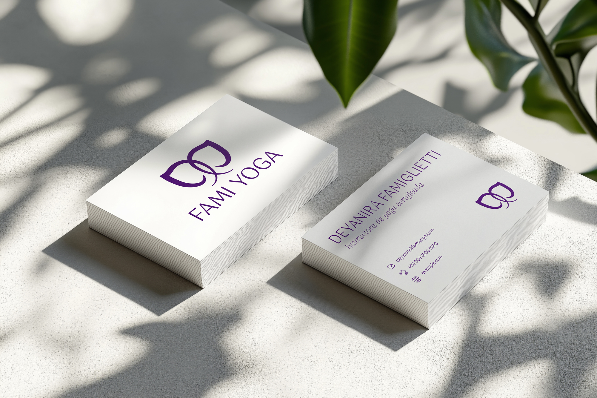
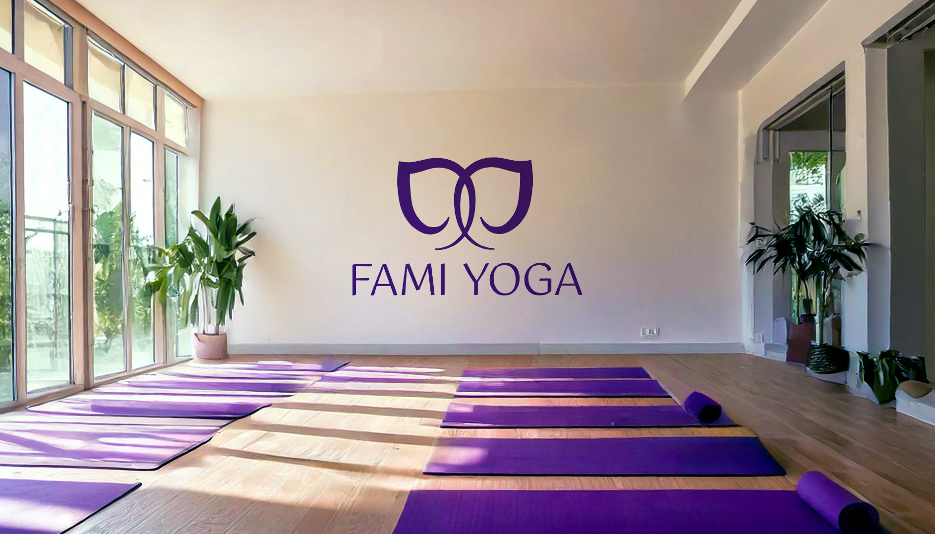
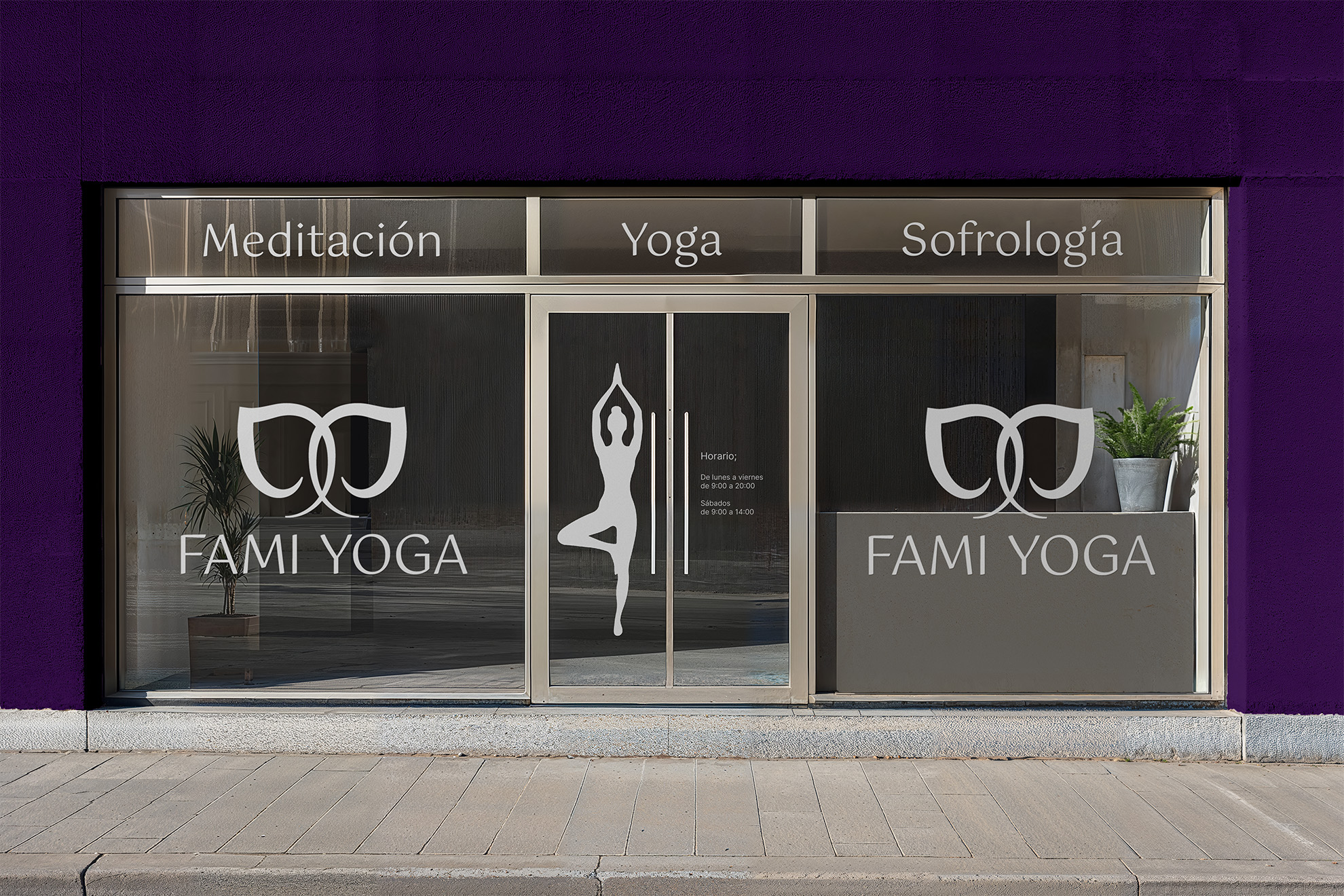
The elephant was chosen as it is not only symbolic of strength, wisdom, and peace in yoga traditions but also holds personal significance for the brand’s founder as her favorite animal. The design integrates seamlessly with the brand’s color palette and typography, ensuring visual coherence and reinforcing the brand’s identity.

The results
The new logo effectively embodies the brand’s values of empathy, balance, and self-acceptance, while symbolizing connection and harmony. It has helped the brand stand out in the wellness and therapeutic services sector, attracting clients who resonate with its personalized and empathetic approach.
The design enhances the brand’s professional image, builds trust among its diverse audience, and establishes a cohesive visual identity that aligns with its mission of promoting mindfulness, well-being, and inclusivity through yoga and holistic practices.